This page is dedicated to coming MS Office 2019 version. Based on design requirements I used following CSS3 features such as svg transform for animation, gradients for interesting Headers effect, flex-box for layout.
MS Office Versions Comparison Page
Versions Comparison Page helps users easily to see most popular MS Office versions and navigate to particular one using tabs. This is a custom Magento Module which I built to encapsulate data, functionality and view for this particular page.
Knowledge Base Pages about MS Office
This is a set of pages about troubleshooting MS Office products installation, activation and other most common questions. I like this type of complex tasks, because they require to plan your workflow, organize code and file structure in advance. There are 12 pages with similar design and layouts. So in this particular case I identified design patterns and created one common stylesheet for all pages and then specific css files with individual style for each page. As result, there is only one place for editing most of the style, however it's possible to customize each page individually too if needed.
Tools:
HTML/HTML5, XML
LESS/SASS, CSS/CSS3
Javascript/jQuery
PHP/PHTML
GIT
InVision, Photoshop
Responsive Web Design (RWD)
Command-line user interface (Terminal)
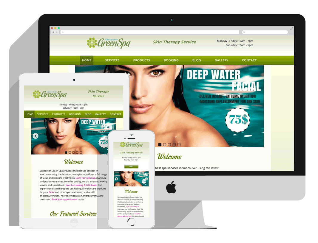
Spa Salon Website
Vancouver Green Spa
Freelance Project
Completed: December 2016
Overview:
Revamped the user interface and experience for Vancouver Green Spa, a beauty salon. The objective was to offer a CMS with user-friendly interface, making it easy for the owner to create and manage content,
find a cost-effective booking system and create modern look and feel while retaining the current style with subtle modifications.
Wireframes and Mockupmockups provide a concise visual overview of the refined structure and features.
Key Achievements:
Designed a new intuitive and visually appealing interface, optimizing the user journey.
Migrated from an old website to the Wordpress platform.
Implemented responsive design principles for seamless cross-device functionality.
Implemented a simplified booking process.
Impact:
The redesigned platform elevated the brand's visual identity and significantly improved user satisfaction.
Tools:
WordPress
UI/UX Design
Wireframing Tools
Illustrator
GIT
SASS
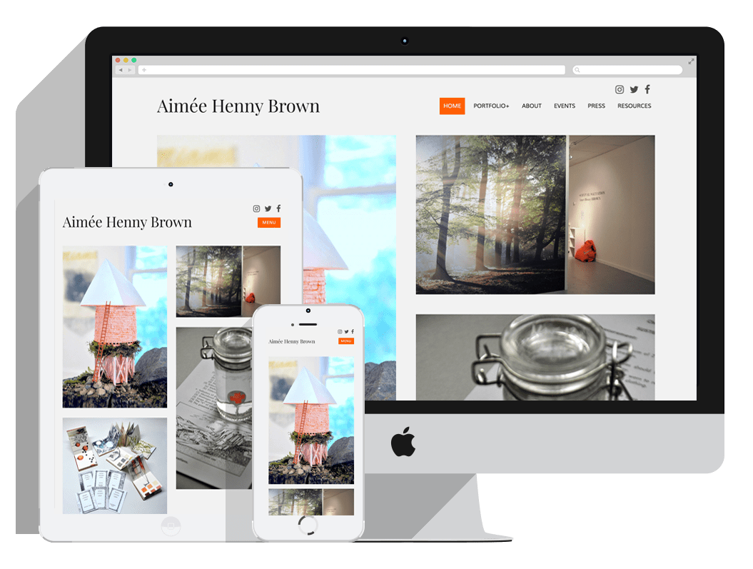
An Artist’s Portfolio Website
Portfolio Website
Final Project, Technical Web Design Program, BCIT
Completed: October 2016
Overview:
Collaborated with a team of three partners to conceptualize, redesign old website, and develop a contemporary website for artist Aimée Henny Brown.
Employed a responsive approach using the Underscores Starter Theme and implemented top-tier UI/UX practices for an enhanced user experience.
Key Achievements:
Executed thorough wireframing to strategically plan and optimize user interactions.
Crafted two distinct mockup versions (Version A, Version B) to explore design alternatives and refine the final aesthetic.
Migrated from an old website to the Wordpress platform.
Impact:
The revamped website showcased Aimée Henny Brown's artistic portfolio in a visually engaging and user-friendly manner, effectively elevating her online presence and facilitating seamless exploration of her work.
Tools:
WordPress
UI/UX Design
Wireframing Tools
Illustrator
GitHub
SASS
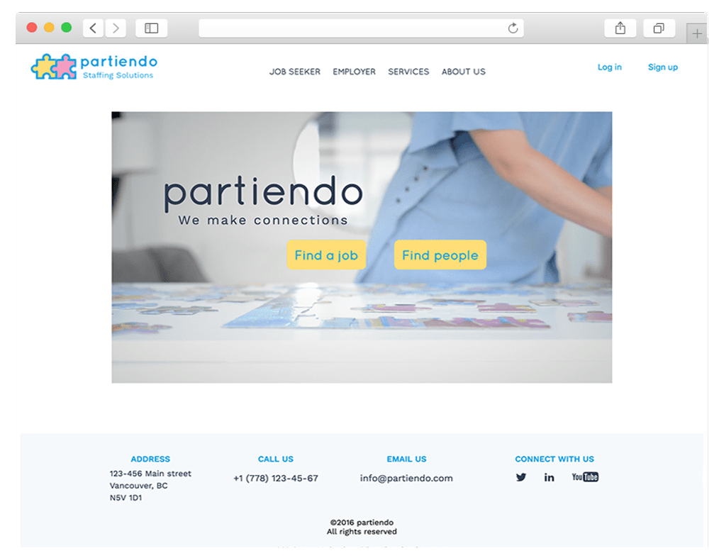
Partiendo. Business Brochure Website
Partiendo
Technical Web Design Program Project, BCIT
Completed: June 2016
Overview:
It was a BCIT project as part of HTML and CSS Course at the Technical Web Design Program. The objective of this assignment was both the high code quality and the creative, user-friendly aspects of the design.
The project centers around crafting a website for the fictional recruitment agency, “Partiendo”.
Context:
“Partiendo” is a boutique agency based in Vancouver, a team of four dynamic professionals.
The aim was to create a design that reflects their modern and flexible approach to personnel search and selection, while underscoring their expertise in specific fields.
Key Achievements:
Balancing creativity and usability in design to showcase the agency's flexibility and modern approach.
Crafting a non-formal design to highlight the agency's approachability, expertise, and commitment to client and candidate needs.
Wireframing. Focused on three key pages — Home, Job Seeker, and About — wireframes were designed in the Balsamiq tool.
Features include:
- Action buttons on the Home page, differentiating between employers and candidates.
- The Job Seeker page prioritizes the search section and CV submission, complemented by informative articles about the agency's services.
- The About page provides a structure with the company's story, expertise, client list, and recruiter details.
Style and Mood Creation. Two styletile versions were developed, each with distinct color palettes and subtle content presentation variations. The final style, characterized by vibrant colors and a combination of “Quicksand” and “Work Sans” fonts, aligns seamlessly with the design goals, promoting a dynamic and engaging visual identity.
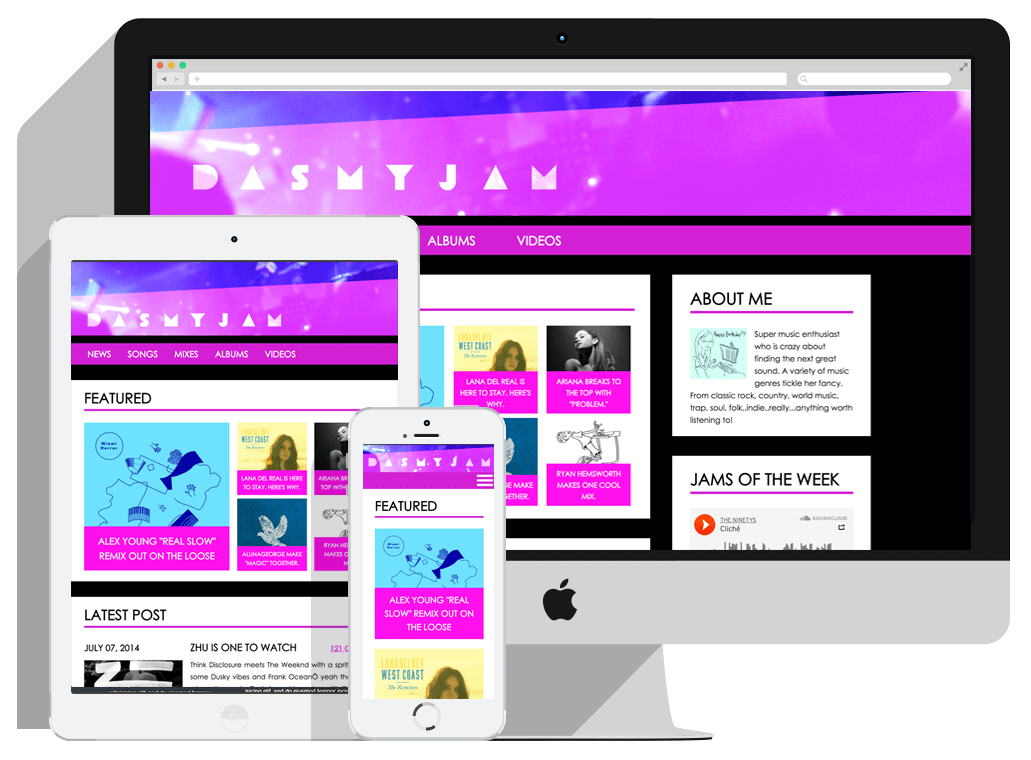
This page was designed for mobile devices first. I used CSS3 Flexbox mode which helps elements behave predictably and Media Queries with two breakpoints at 575px and 960px.
It was small group project where me and a partner created fully responsive web page that matched to the design of the mock-up. I was responsible for aside, trending posts sections and footer. The challenging part for me was to create
responsive iframes using positioning and percentages and to fit them in given layout.
For this project we wrote our CSS using SASS and used version control system Git and stored code on GitHub.
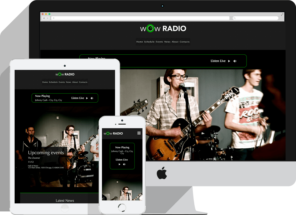
This is a single responsive web page for a fictional radio station — “WOW Radio”.
My preferable way to create responsive content is using the CSS3 Flexible Boxes, or Flexboxes. I find the flexbox model effective and easy to use for complex layouts. For example, I can easily change order or direction of content,
horizontally or vertically align items, specify the length of a flex items etc. In my opinion, flexbox concept is a new level of creating responsive website layouts comparing with floats.
To ensure that my layout will be adaptable to any current and future devices, I prefer to set breakpoints based on content, not defined device widths. Also I use Chrome DevTools’ Device Mode and viewport controls (responsive
or device-specific mode) to test layout.
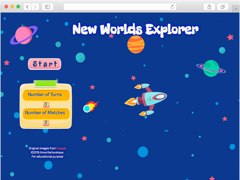
This was Level 01 project for JavaScript and jQuery Course at TWD Program.
In addition to creating matching game with traditional logic, my aim was to make fun game with animated cartoon graphic and some story. I chose space theme where a user become a scientist in an expedition to remote planets and his
goal is to find and collect new species.
Animated rocket ship in the beginning of the game and animated asteroid and aliens in the end were made by using animate.css library.
Note: layout of this project is not responsive due to time limit.